
Intellect: Graphs

Do you have to make a presentation and need charts or displays? Intellect offers the option of plotting graphs for the number of appointments for selected dates and a selected parameter of Appointment Type, Doctor, or Facility. Graphs can be produced in the three different styles: pie graphs, bar graphs, and line graphs.
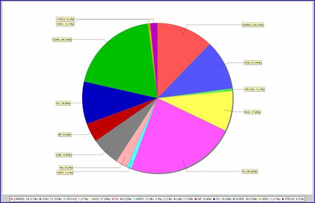
Pie Graph
The Pie Graph creates a colored segment for each selected appointment type such as surgery, x-ray, or new patient. The segment represents its portion of all appointments and has a label attached with the code of the selected appointment type, the amount of appointments for the segment, and the percentage of the total appointments for the date range. In addition to the labeled pie chart, a legend also appears at the bottom of the graph indicating the code, amount of appointments, percentage of total and color of the selected parameters segment.
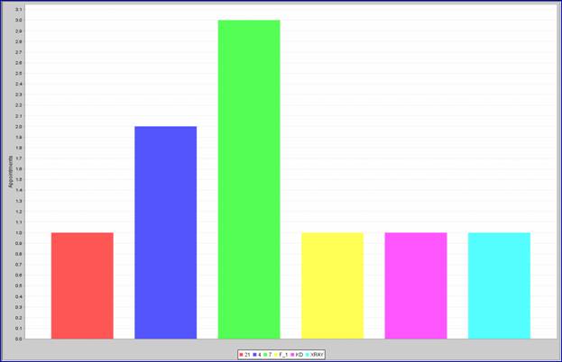
Bar Graph
The Bar Graph vertically displays the total appointment count for the selected time frame which is then used to plot your selection of Appointment Type, Doctor, or Facility on a horizontal axis. For example, a Bar Graph can indicate how many appointments each doctor had in a given time frame by displaying a different colored vertical bar for each doctor. A legend also appears at the bottom of the graph indicating the code and color of each selected doctor.
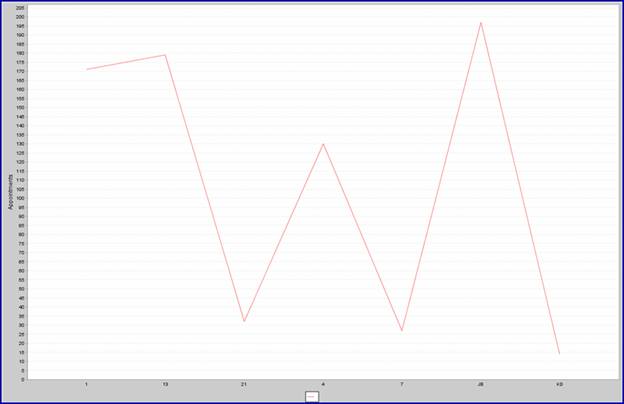
Line Graph
The Line Graph is similar to the Bar Graph in that it vertically displays the total appointment count for the selected time frame but then, instead of vertical bars, the Line Graph uses a horizontal line to indicate the appointment count for your selection of Appointment Type, Doctor, or Facility.
Each of Intellect’s graphs can each be printed, Faxed, or emailed, depending on the set up of your system.
If you would like help using these feature, please contact Prime Clinical support.